Interactive Microlearning Prototype | Storyline + Python
Teams often struggle to draw consistent insights from data because different visualizations highlight different patterns. This microlearning module helps learners recognize how visualization choices shape interpretation and decision-making.
How it’s designed
- Short, self-contained interactive built in Storyline
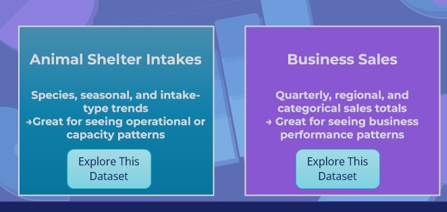
- Two real-world datasets (operations and sales)
- Learners compare multiple chart views of the same data
- Reflection prompts focus on choosing a visualization that supports a decision
This module is intentionally scoped as a minimum viable learning experience, not a complete data analysis course.
What it solves
Clear visualization choices reduce confusion, speed alignment, and support better conversations around data in reviews, planning discussions, and decision-making contexts. This project focuses on judgment and interpretation rather than tools or formulas.
Instructional Strategies
This micro-module is designed as a lightweight introduction to how visualization changes what we notice in data, not a tool-training or analytics certification. The instructional focus is on exploration, comparison, and reflective noticing rather than procedural walkthroughs. Learners interact with multiple chart views and compare what becomes visible (or invisible) when the visualization changes.
- Guided Exploration, Not Tutorials: Learners switch between chart states to see how each view highlights different features of the same dataset (e.g., species vs. month vs. intake type). This builds intuition without overwhelming instruction.
- Noticing → Naming → Interpreting: Prompts in the reflection slide ask learners to verbalize what changed and why it matters, creating a bridge from visual observation to meaning.
- Low Cognitive Load Visualization: Each view isolates a single lens at a time rather than stacking filters or interactions, which keeps the cognitive burden low while still modeling analytical thinking.
- Contextual Choice, Not Skill Mastery: The module emphasizes “which view helps you see the story?” instead of teaching how to build charts, keeping the experience scoped to insight, not software.
Behind the scenes
This module was built in Articulate Storyline to support rapid iteration, LMS compatibility, and controlled interactivity. The design uses a single, repeatable interaction pattern to keep cognitive load low and allow learners to focus on comparison rather than navigation.
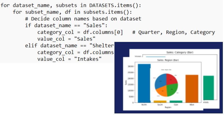
To avoid static examples, visualizations were generated using Python (pandas and matplotlib) and imported into Storyline as assets. Storyline variables control which dataset and chart view are displayed, allowing learners to explore multiple perspectives on the same data without introducing unnecessary complexity or performance overhead.
Design decisions were intentionally conservative:
- One interaction pattern, reused consistently
- Limited datasets to support focused comparison
- No prescriptive “correct” answers, only reflection prompts
- Scope capped to interpretation rather than analysis or tooling
Several potential enhancements (additional datasets, dashboard-style views, learner-uploaded data) were deliberately excluded to preserve clarity and keep the module aligned to its core goal: helping learners recognize how visualization choices shape insight.
Designed to support insight, not overwhelm.
Explore
This module is currently undergoing revisions and will return on February 1. Design documents and supporting assets (including exploratory visualizations) are available in a linked Google Drive Folder.
Tools Used
Data handling: Python · Pandas · Matplotlib · CSV data workflow
Module: Storyline · Canva · WordPress (Bluehost)